Razer Kraken Kitty
Branding
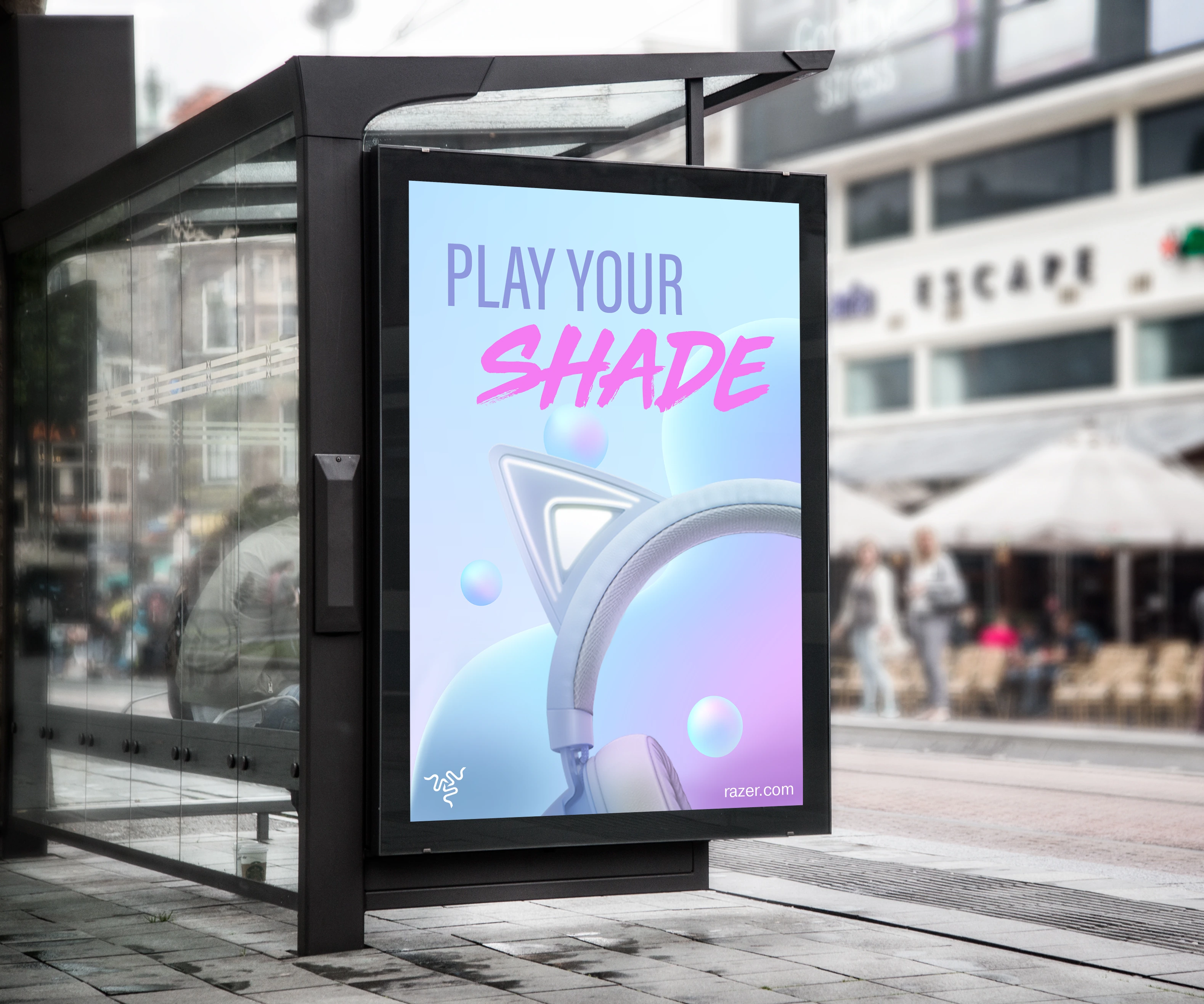
I developed a conceptual campaign for Razer Kraken Kitty, exploring how its playful design could connect with a wider range of personal styles. While the headset was closely associated with pink, I saw an opportunity to imagine a broader color story without losing the product’s recognizable personality.
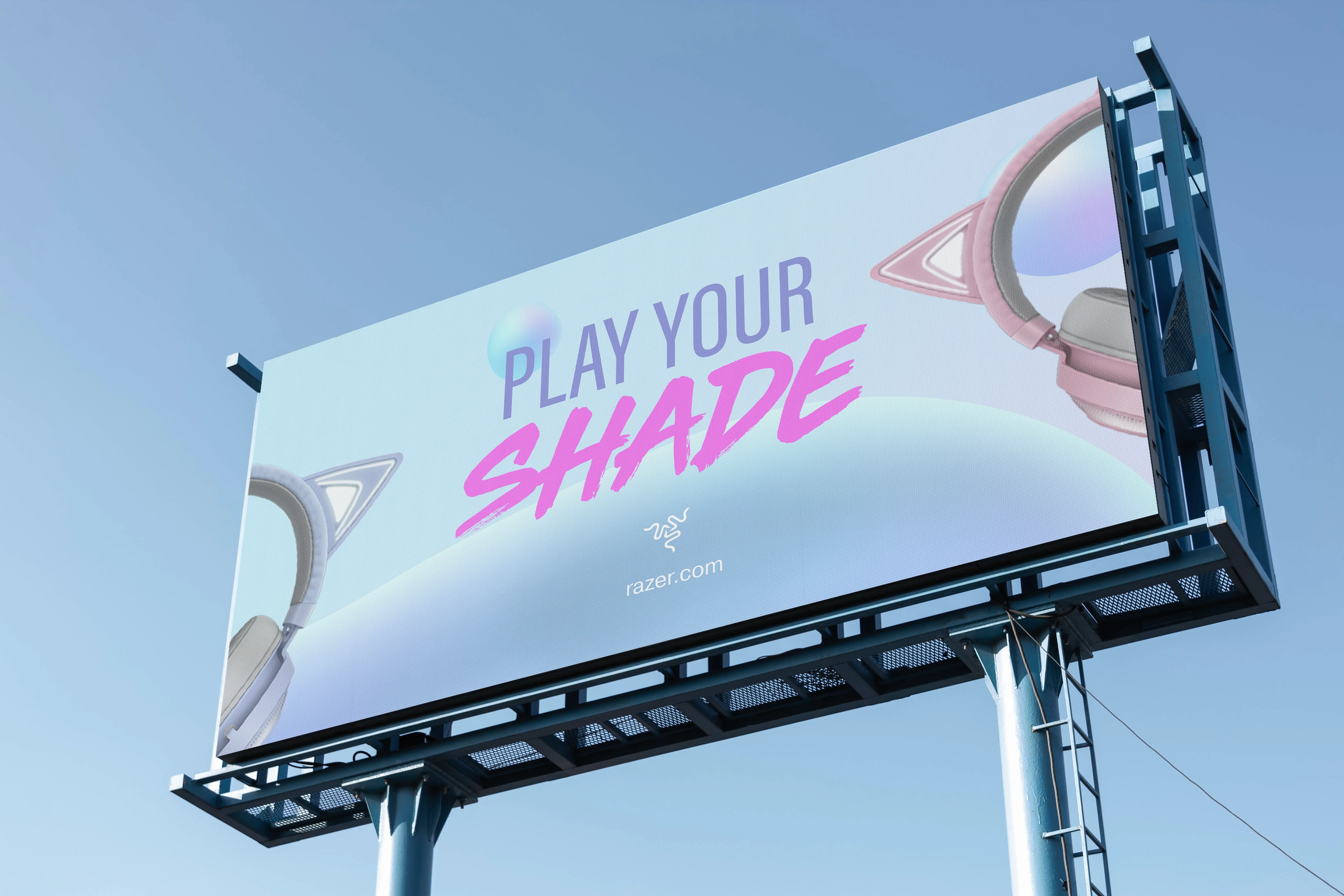
The project brings together an updated logo concept and the Play Your Shade campaign, extending the visual direction across packaging, outdoor advertising, social media, email, and motion.
LOGO PROCESS
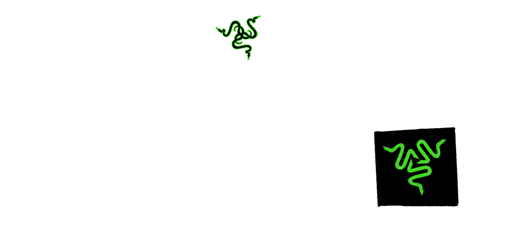
Rethinking the mark
I explored simplifying Razer’s three-headed snake symbol to make it more legible at smaller sizes. The sketches focused on reducing visual complexity while preserving the triangular silhouette and energy of the original mark.
The final concept retains the brand’s recognizable shape and green accent, with a cleaner approach designed to work across different backgrounds and applications.
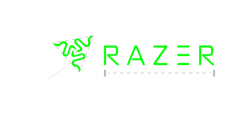
Always in triangular formation

LOGO APPLICATION
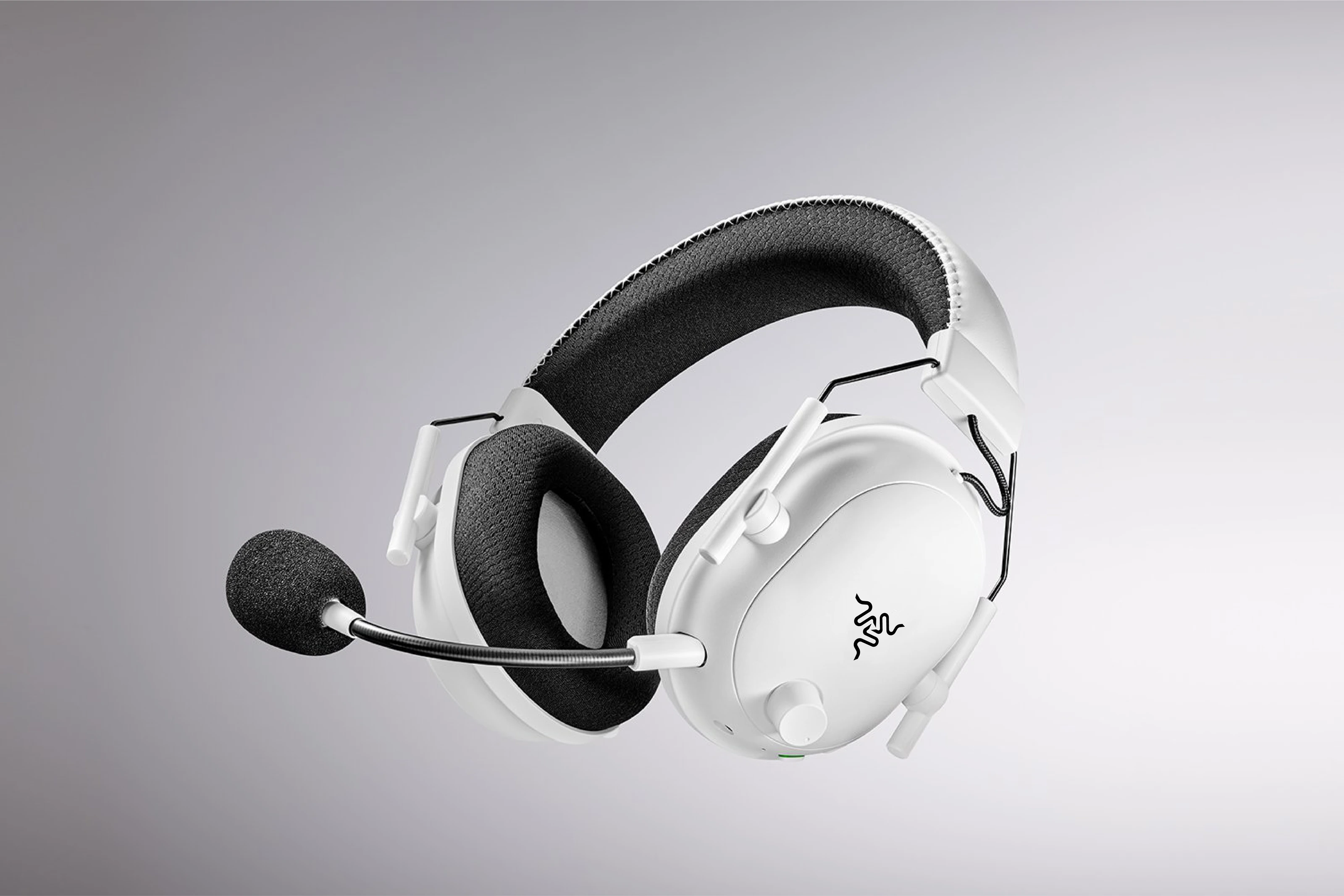
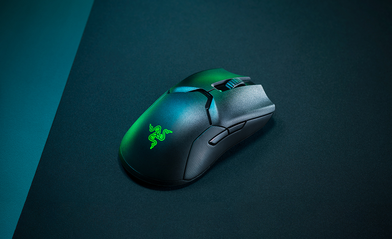
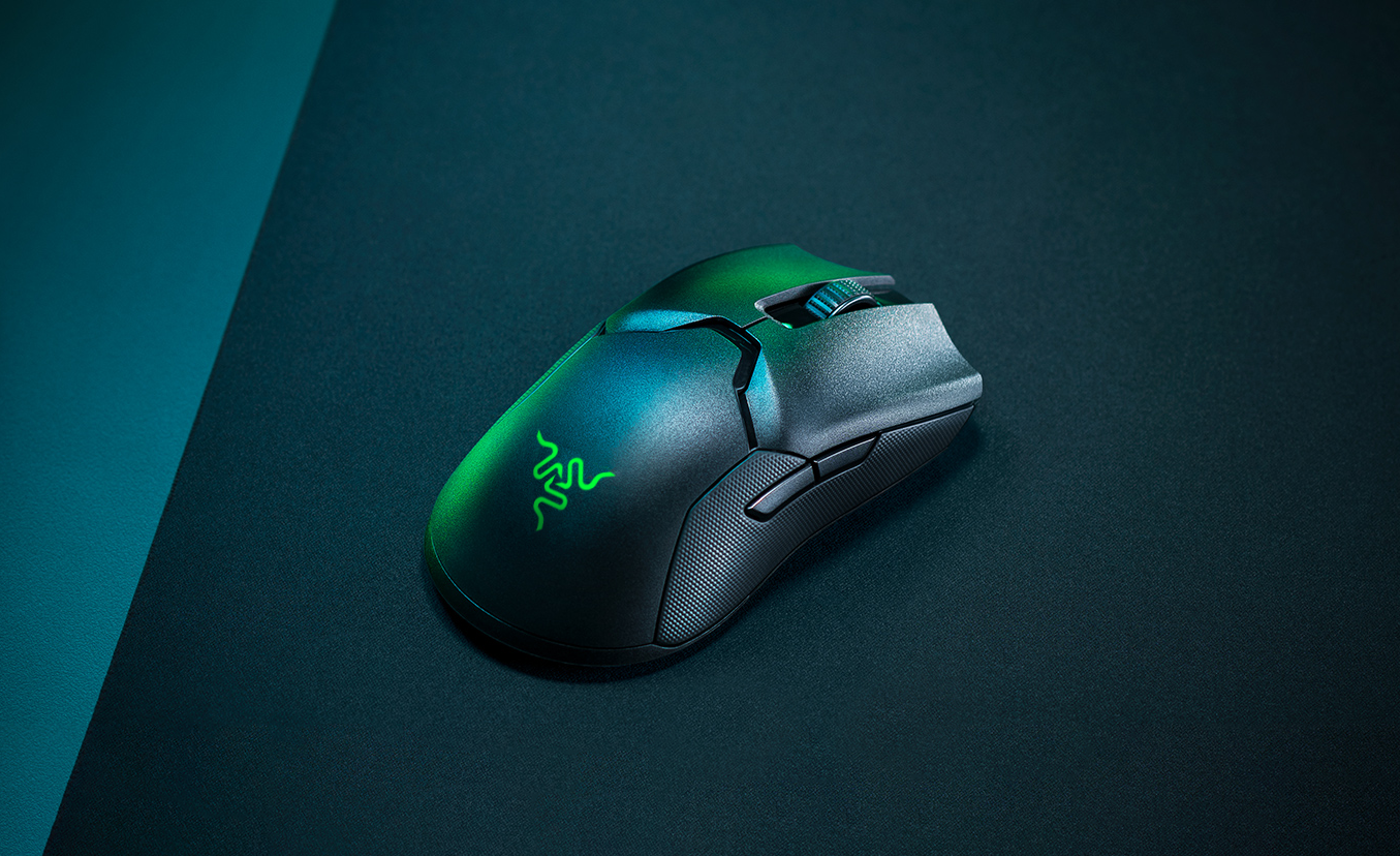
Old vs. new Razer
A side-by-side comparison showing how the simplified mark works on Razer headsets and mice.
BRAND APPLICATION
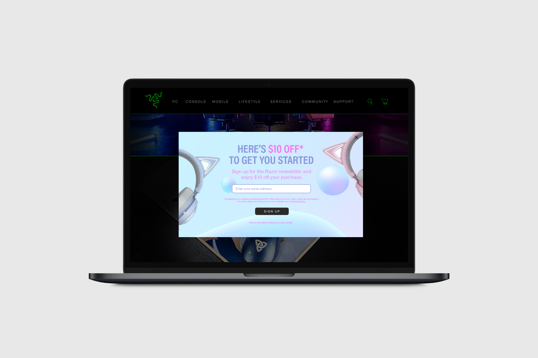
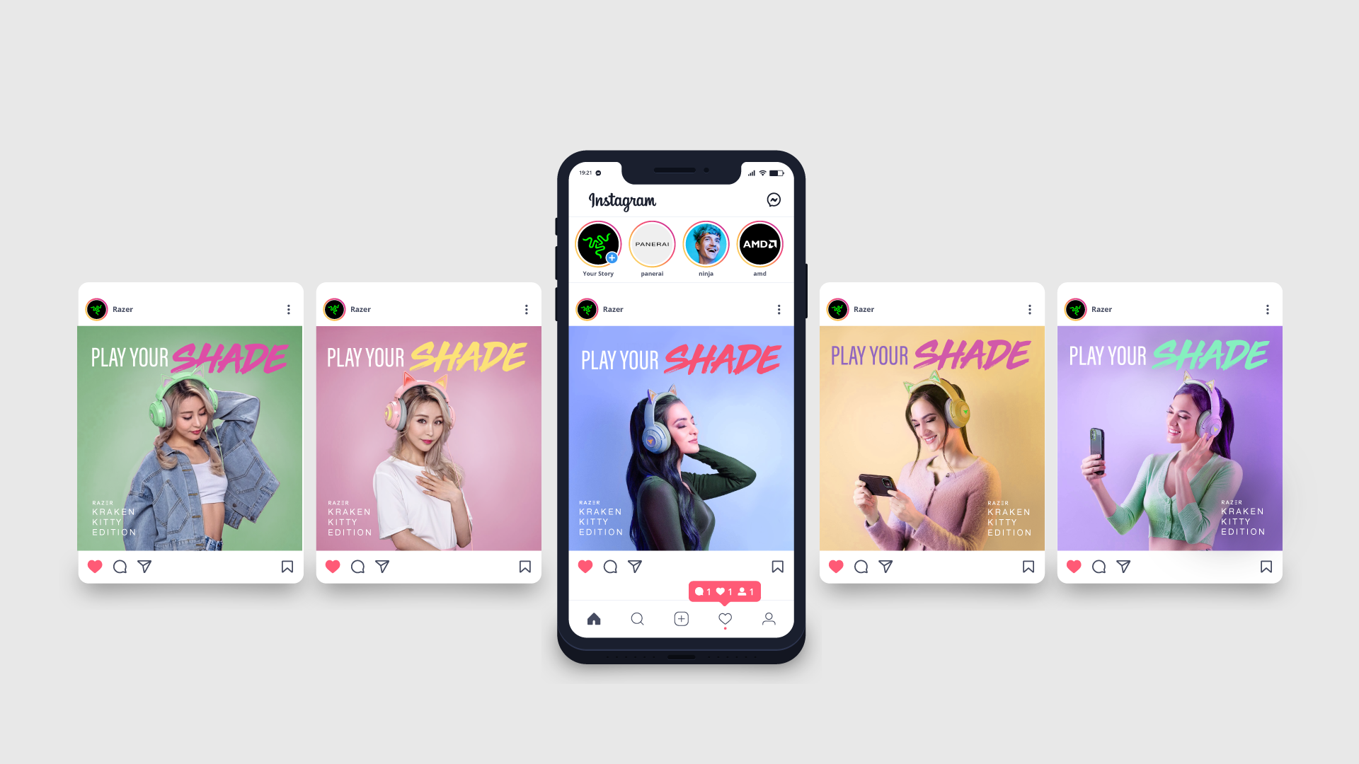
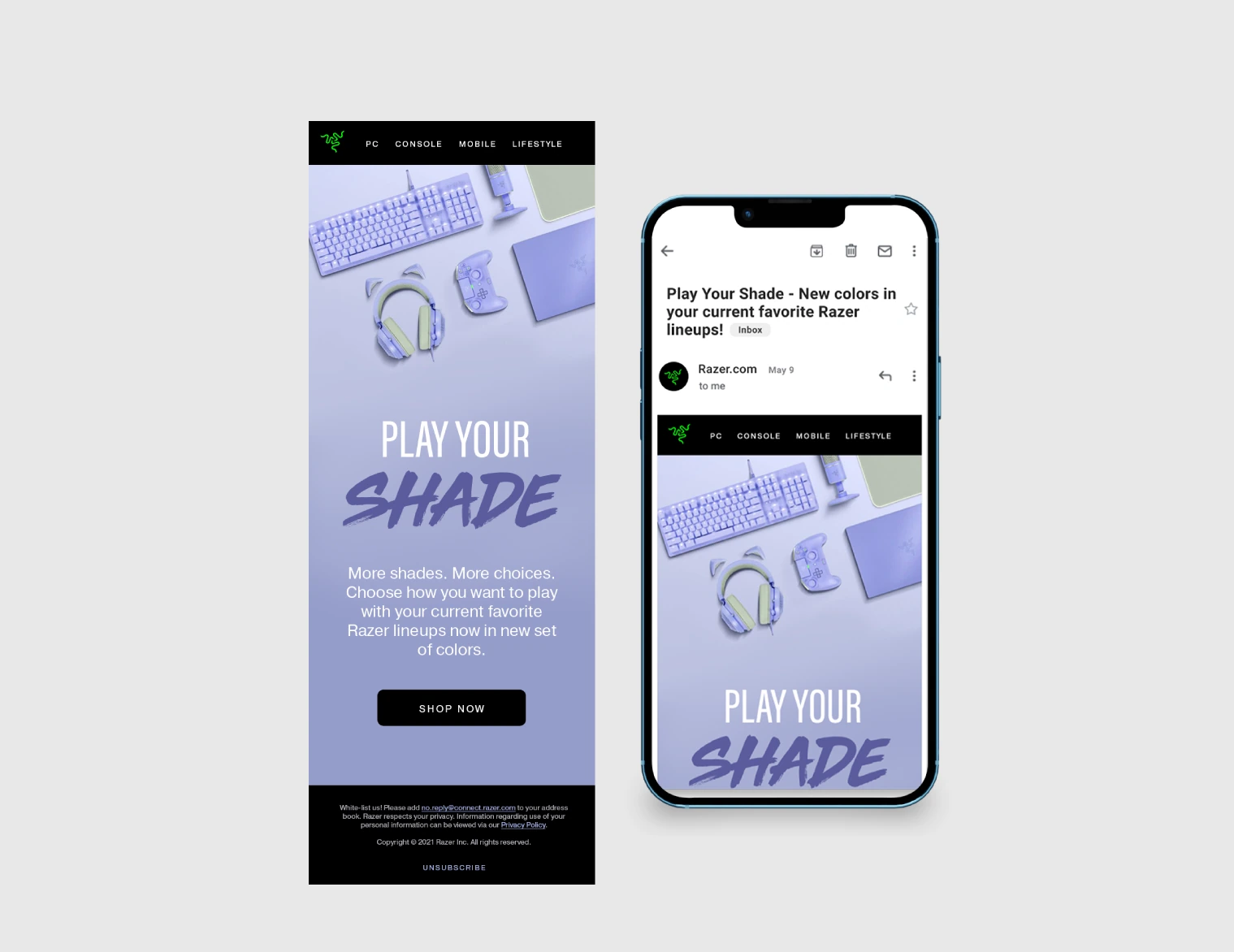
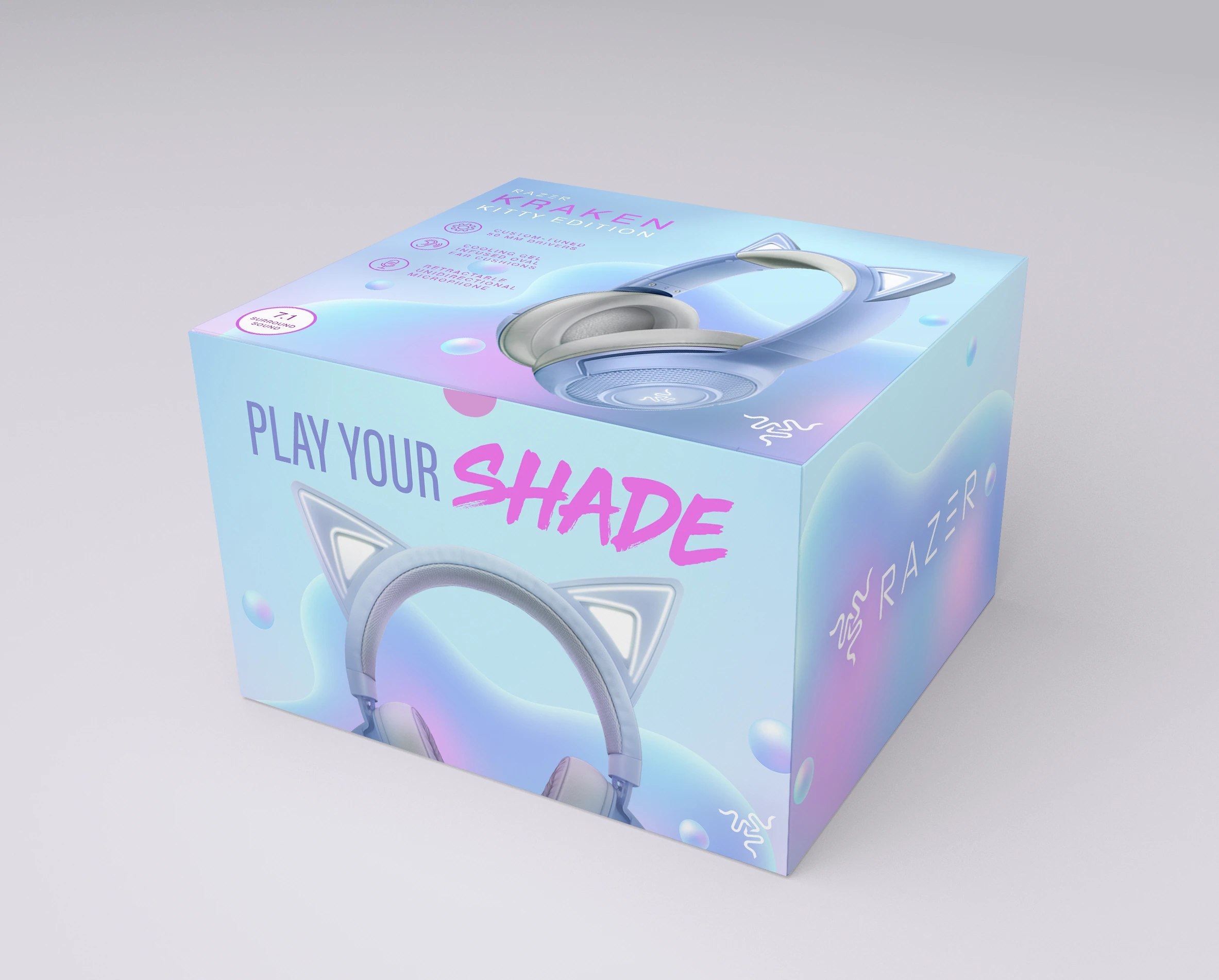
Razer Kraken Kitty Deliverables
Play Your Shade imagines the Kraken Kitty headset in a wider range of colors, using soft gradients, bright accents, and expressive typography to reflect different gaming styles. I carried the campaign idea through digital, print, and environmental mockups to show how one visual system could work across multiple touchpoints.